Media
Media includes responsive images, figures and video classes.
Images
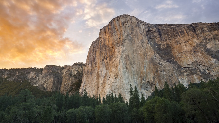
Add the img-responsive class to <img> elements. The images will scale with the parent sizes.

<img src="img/osx-el-capitan.jpg" class="img-responsive ..." alt="...">
Add the img-fit-contain or img-fit-cover class to <img> or <video> elements. The media will crop itself to fit inside the element (and you don't need another container).
This feature can replace the classic background image trick. Microsoft Edge support is shipped with Build Number 16299+.


<img src="img/osx-el-capitan.jpg" class="img-fit-contain ..." alt="...">
<img src="img/osx-el-capitan.jpg" class="img-fit-cover ..." alt="...">
Figure
You can use the element <figure> for an image with a caption.
Add the figure class to <figure> element.
The images with the img-responsive class will be responsive.
And the included class figure-caption will provide basic style for caption.
Also, you can use text-left, text-center and text-right for caption alignment.

<figure class="figure">
  <img class="img-responsive ..." src="img/osx-yosemite-2.jpg" alt="macOS Yosemite Wallpaper">
  <figcaption class="figure-caption text-center">macOS Yosemite wallpaper</figcaption>
</figure>
Video
For responsive video, add a container with the video-responsive class.
Insert any YouTube, Youku or other iframe/embed video inside the container.
The ratio is 16:9 by default.
You may add video-responsive-4-3 for 4:3 ratio video container or video-responsive-1-1 for 1:1 ratio.
For responsive <video> elements, you can add the video-responsive class directly.
<div class="video-responsive video-responsive-4-3">
  <iframe src="..." width="..." height="..." frameborder="0" allowfullscreen></iframe>
</div>

<video class="video-responsive" src="...">...</video>
